How to Avoid Using Designs That Neglect the Touch Screen Capabilities of Mobile Devices
Learn how to optimize your designs for mobile devices by avoiding common mistakes that neglect touch screen capabilities. Discover essential tips for creating user-friendly interfaces that enhance the touch experience on smartphones and tablets.
In today’s digital age, mobile devices are an integral part of our daily lives. With billions of users worldwide relying on smartphones and tablets to access websites, it’s crucial to design with these devices in mind. Touchscreen technology has revolutionized how we interact with content, making it essential for web designers to create interfaces that are not only visually appealing but also functional on touchscreens.
Neglecting to account for touchscreen capabilities can lead to frustrating user experiences, higher bounce rates, and ultimately, a loss of potential customers. In this blog, we’ll explore how to avoid common pitfalls in design that overlook the needs of touchscreen users and provide actionable tips to create mobile-friendly designs that enhance user engagement and satisfaction. Understanding the Importance of Touchscreen Design
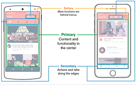
Before diving into the specifics of touchscreen-friendly design, it’s important to understand why it matters. The way users interact with touchscreens is fundamentally different from how they interact with traditional desktop computers. Unlike a mouse, which allows for precise clicks, a finger is less accurate and often requires larger touch targets. Moreover, gestures like swiping, pinching, and tapping have become second nature to mobile users, and your design needs to accommodate these behaviors.
Key Considerations:
- Touch Targets: Ensure that buttons, links, and interactive elements are large enough for users to easily tap without missing or accidentally tapping something else.
- Gestures: Incorporate common touchscreen gestures into your design, such as swiping to navigate through content or pinching to zoom.
- Responsive Design: Create layouts that adjust seamlessly between different screen sizes and orientations, providing a consistent experience on all devices.
Common Mistakes in Touchscreen Design
To create an optimal user experience on touchscreens, it’s essential to avoid some common design mistakes. Here are a few pitfalls that can negatively impact touchscreen usability:
Small Touch Targets
One of the most frequent issues in touchscreen design is using touch targets that are too small. When buttons or links are too tiny, users may struggle to tap them accurately, leading to frustration. The ideal touch target size is generally around 44x44 pixels, as recommended by Apple’s Human Interface Guidelines.
Ignoring Gestures
Designs that don’t account for common touchscreen gestures can feel clunky and outdated. For instance, not allowing users to swipe through image galleries or scroll horizontally can lead to a poor user experience.
Dense Content
On a small screen, cramming too much content into a single view can overwhelm users. It’s essential to break up content into digestible chunks, use ample whitespace, and prioritize the most important information.
Poorly Placed Elements
Placing interactive elements too close together can lead to accidental taps, which can be frustrating for users. Ensure there is enough space between touch targets to avoid this issue.
Best Practices for Touchscreen Design
Now that we’ve covered what not to do, let’s focus on best practices for designing with touchscreens in mind. Implementing these strategies will help you create a user-friendly experience that leverages the full potential of mobile devices.
Prioritize Mobile-First Design
A mobile-first approach means designing for the smallest screen first and then scaling up. This method ensures that the most important elements are easily accessible on mobile devices and prevents the need for excessive resizing or rearranging on larger screens.
Benefits:
- Simplified Layouts: Starting with mobile-first design encourages simplicity and clarity, which are key components of good touchscreen design.
- Enhanced Performance: Mobile-first designs are often lighter and faster, improving load times and reducing bounce rates.
Use Large, Tappable Buttons
As mentioned earlier, touch targets should be large enough to tap easily. Consider the context in which users will be interacting with your site; if they’re on the go, they may only have one hand available to use their device. Large, tappable buttons make navigation easier and more intuitive.
Tips:
- Button Size: Aim for a minimum touch target size of 44x44 pixels.
- Spacing: Ensure there is enough space between buttons and other interactive elements to prevent accidental taps.
Incorporate Touchscreen Gestures
Take advantage of the natural gestures that users are accustomed to on touchscreens. This includes swiping, pinching, and tapping. For example, allowing users to swipe through a carousel of images or pinch to zoom in on a product photo can enhance the user experience.
Examples:
- Swiping: Use horizontal swipes for navigating between pages or image galleries.
- Pinching: Allow users to zoom in on images or maps with a pinch gesture.
- Tapping: Ensure that all tappable elements are responsive and provide visual feedback when tapped.
Simplify Navigation
Navigation should be straightforward and easy to use on a touchscreen. Dropdown menus and complex navigation structures can be difficult to operate on a small screen. Instead, opt for a simple, intuitive navigation system that is easily accessible with a tap.
Recommendations:
- Hamburger Menus: Use a hamburger menu to collapse navigation options into a single, easily accessible menu.
- Sticky Navigation: Keep the most important navigation elements visible as the user scrolls, so they don’t have to navigate back to the top of the page.
Optimize for Different Screen Sizes
Not all mobile devices are created equal; they come in a variety of screen sizes and resolutions. To ensure your design looks great on all devices, implement responsive design techniques that adjust the layout based on the screen size.
Techniques:
- Fluid Grids: Use fluid grids that resize based on the screen’s width.
- Flexible Images: Ensure that images scale appropriately without losing quality or becoming pixelated.
- Media Queries: Implement media queries in your CSS to apply different styles based on the device’s screen size.
Tools and Resources for Touchscreen Design
Designing for touchscreens doesn’t have to be a daunting task. There are numerous tools and resources available to help you create mobile-friendly designs that look great and function flawlessly on touchscreens.
Prototyping Tools
Prototyping tools allow you to create interactive mockups of your design, enabling you to test how it will function on a touchscreen before development begins. Some popular tools include:
- Figma: A web-based design tool that allows for real-time collaboration and interactive prototyping.
- Adobe XD: A vector-based design tool that provides robust prototyping features and integration with other Adobe products.
- InVision: A design platform that enables designers to create clickable prototypes and gather feedback from stakeholders.
User Testing Platforms
User testing is essential for ensuring that your design is user-friendly on touchscreens. Platforms like UserTesting and UsabilityHub allow you to gather feedback from real users and identify potential issues before launching your design.
Mobile Emulators
Mobile emulators simulate how your design will appear on various devices, allowing you to test different screen sizes and resolutions. Tools like Google’s Chrome DevTools and BrowserStack are invaluable for testing your design across multiple devices without needing physical hardware.
Case Studies: Successful Touchscreen Design
Learning from real-world examples can provide valuable insights into what works (and what doesn’t) in touchscreen design. Below are a few case studies of companies that have successfully implemented touchscreen-friendly designs:
Airbnb
Airbnb’s mobile app is a prime example of a well-designed touchscreen interface. The app features large, tappable buttons, intuitive swipe gestures, and a clean, minimalist layout that makes it easy for users to navigate and book accommodations on the go.
Pinterest’s mobile app is another great example of touchscreen design. The app’s infinite scroll feature and intuitive pinch-to-zoom functionality make it easy for users to explore and save ideas. The design is visually appealing while being optimized for touch interactions.
Slack
Slack’s mobile app demonstrates the importance of simplicity in touchscreen design. With a straightforward navigation system and easily tappable elements, the app makes it easy for users to communicate and collaborate from their mobile devices.
Designing for touchscreens is no longer optional in a world where mobile devices dominate. By prioritizing touchscreen-friendly design principles, you can create a user experience that is both enjoyable and functional for mobile users. Avoiding common mistakes, implementing best practices, and leveraging the right tools will ensure that your design is not only visually appealing but also highly functional on touchscreens.
Remember, the key to successful touchscreen design is understanding how users interact with their devices and creating interfaces that accommodate these interactions. By doing so, you’ll be well on your way to designing websites and apps that are not only beautiful but also intuitive and user-friendly.
Call to Action: If you’re ready to take your mobile design to the next level, consider partnering with a professional web design agency that specializes in touchscreen-friendly design. With expert guidance and a focus on user experience, you can create a website or app that not only looks great but also performs flawlessly on all devices.
Meta Description: Discover how to design websites and apps that are optimized for touchscreen devices. Learn about common pitfalls, best practices, and tools to create user-friendly, mobile-first designs that enhance the user experience.
Accessibility in Touchscreen Design
Accessibility is a crucial aspect of web design, particularly when it comes to touchscreens. Designing with accessibility in mind ensures that your website or app is usable by as many people as possible, including those with disabilities. This not only helps you reach a wider audience but also demonstrates your commitment to inclusivity.
Consideration for Users with Motor Disabilities
For users with motor disabilities, precise tapping can be challenging. Ensuring that your design has large touch targets and is easy to navigate with minimal effort is essential. Features like voice commands, screen readers, and alternative input methods can also enhance accessibility for these users.
Tips:
- Larger Touch Areas: Increase the size of interactive elements to accommodate users with limited motor skills.
- Voice Navigation: Integrate voice controls to allow users to navigate without relying solely on touch.
- Minimal Gestures: Avoid designs that require complex gestures, as they can be difficult for some users to perform.
Color Contrast and Visual Impairments
Users with visual impairments may have difficulty distinguishing elements with low color contrast. Ensuring that your design meets Web Content Accessibility Guidelines (WCAG) for color contrast can make your content more accessible.
Tips:
- High Contrast: Use high-contrast color schemes to make text and buttons stand out.
- Scalable Text: Allow users to easily increase the font size without breaking the layout.
- Descriptive Labels: Provide clear and descriptive labels for all buttons and interactive elements.
Screen Reader Compatibility
For users who rely on screen readers, it’s important that your design is compatible with these tools. This means ensuring that all interactive elements have appropriate labels and that the content is structured in a logical and navigable manner.
Tips:
- ARIA Labels: Use ARIA (Accessible Rich Internet Applications) labels to describe the function of interactive elements.
- Logical Structure: Organize content in a way that is easy to follow when read aloud by a screen reader.
- Keyboard Navigation: Ensure that all functions can be performed using a keyboard, not just touch input.
Performance Optimization for Touchscreen Devices
Performance is a key factor in the success of any website or app, particularly on mobile devices. Slow loading times, unresponsive elements, and lag can frustrate users and lead to higher bounce rates. Optimizing performance is crucial for delivering a seamless experience on touchscreen devices.
Minimizing Load Times
Mobile users often access content on the go, making speed a top priority. Optimizing your website or app to load quickly on mobile devices is essential for keeping users engaged.
Tips:
- Optimize Images: Compress images to reduce load times without sacrificing quality.
- Minify Code: Reduce the size of your CSS, JavaScript, and HTML files by removing unnecessary code.
- Lazy Loading: Implement lazy loading to defer the loading of non-essential images and scripts until they are needed.
Ensuring Smooth Interactions
Touchscreen users expect smooth, responsive interactions. Delays in response to taps, swipes, or other gestures can lead to frustration and a poor user experience.
Tips:
- Responsive Animations: Use hardware-accelerated animations to ensure they run smoothly on mobile devices.
- Efficient JavaScript: Optimize JavaScript to avoid blocking the main thread, which can cause delays in user interactions.
- Fast Feedback: Provide immediate visual feedback when users interact with elements, such as highlighting buttons when tapped.
Future Trends in Touchscreen Design
As technology continues to evolve, so too do the possibilities for touchscreen design. Staying ahead of emerging trends can help you create innovative, future-proof designs that meet the changing needs of users.
Gestural Interfaces
As users become more accustomed to gestural interfaces, designs that incorporate advanced gestures (beyond simple taps and swipes) will become increasingly popular. This could include multi-finger gestures, long-press actions, or even gesture-based shortcuts.
Example:
- Multi-Finger Gestures: Incorporating gestures like a three-finger swipe to switch between apps or content sections.
- Long-Press Actions: Using long presses to reveal additional options or secondary actions for an element.
Haptic Feedback
Haptic feedback, which provides physical sensations in response to touch interactions, is becoming more sophisticated. Integrating haptic feedback into your design can enhance the tactile experience and make interactions more intuitive.
Example:
- Button Presses: Adding a slight vibration or haptic response when a button is pressed to simulate the feel of a physical button.
- Drag and Drop: Using haptic feedback to indicate when an item has been successfully picked up or dropped.
Augmented Reality (AR) Integration
As AR technology becomes more accessible, integrating AR features into your touchscreen design can offer users a more immersive and interactive experience. This could include features like AR product try-ons, interactive maps, or virtual tours.
Example:
- AR Product Demos: Allowing users to see how a product would look in their environment through their mobile device’s camera.
- Interactive Maps: Using AR to overlay information on a live view of a physical location, enhancing navigation and exploration.
Embracing the Future of Touchscreen Design
Designing for touchscreen devices is a dynamic and ever-evolving challenge that requires staying up-to-date with the latest trends and best practices. By prioritizing accessibility, optimizing performance, and embracing future trends, you can create designs that not only meet the current needs of users but also anticipate and adapt to their future expectations.
Touchscreen devices are here to stay, and as their capabilities continue to expand, so too must our approach to design. Whether you’re creating a website, app, or any other digital interface, keeping the user experience at the forefront of your design process is key to success.
By avoiding common pitfalls, implementing best practices, and continuously iterating based on user feedback, you can ensure that your designs are not only visually appealing but also intuitive, accessible, and highly functional on all touchscreen devices.
Final Call to Action: Are you ready to revolutionize your mobile design strategy? Whether you’re launching a new app or redesigning your website, partnering with experts who understand the nuances of touchscreen design can make all the difference. Reach out today to learn how we can help you create a mobile experience that delights users and drives results.
Updated Meta Description: Learn how to design touchscreen-friendly websites and apps with our comprehensive guide. Discover common mistakes, best practices, accessibility tips, and emerging trends to enhance your mobile user experience.
Frequently Asked Questions (FAQ)
What is touchscreen design, and why is it important?
Touchscreen design refers to creating interfaces and layouts that are optimized for interaction with touchscreens, such as those found on smartphones and tablets. It is crucial because touchscreens have different interaction patterns compared to traditional mouse-and-keyboard setups. Designing with touchscreens in mind ensures that users have a smooth and intuitive experience, leading to higher engagement and satisfaction.
What are some common mistakes in touchscreen design?
Common mistakes include:
- Small Touch Targets: Buttons and interactive elements that are too small for users to tap accurately.
- Ignoring Gestures: Not incorporating or accommodating common touchscreen gestures like swiping or pinching.
- Dense Content: Overloading small screens with too much information, making it difficult to read and navigate.
- Poorly Placed Elements: Interactive elements placed too close together, leading to accidental taps.
What are the best practices for designing touchscreen interfaces?
Best practices include:
- Large, Tappable Buttons: Ensure buttons and interactive elements are large enough to be easily tapped.
- Incorporate Gestures: Design for common gestures like swiping, pinching, and tapping.
- Simplify Navigation: Use straightforward navigation to avoid clutter and confusion.
- Optimize for Different Screen Sizes: Implement responsive design techniques to adapt to various screen sizes and orientations.
How can I improve accessibility in touchscreen design?
To improve accessibility:
- Use Larger Touch Areas: Ensure interactive elements are large enough to be easily tapped.
- Provide High Contrast: Use high-contrast color schemes to make text and buttons stand out.
- Implement ARIA Labels: Use ARIA (Accessible Rich Internet Applications) labels to describe the function of interactive elements for screen readers.
- Ensure Keyboard Navigation: Make sure all functions can be performed using a keyboard in addition to touch input.
What tools can help with touchscreen design?
Helpful tools include:
- Prototyping Tools: Figma, Adobe XD, and InVision for creating interactive mockups and testing touch interactions.
- User Testing Platforms: UserTesting and UsabilityHub for gathering feedback from real users.
- Mobile Emulators: Google’s Chrome DevTools and BrowserStack for simulating how designs will appear on various devices.
How can I ensure my touchscreen design performs well?
To ensure good performance:
- Optimize Load Times: Compress images, minify code, and use lazy loading to improve loading speeds.
- Ensure Smooth Interactions: Use hardware-accelerated animations and optimize JavaScript to avoid delays in user interactions.
- Provide Immediate Feedback: Offer visual feedback when users interact with elements to enhance the responsiveness of your design.
What are some future trends in touchscreen design?
Future trends include:
- Advanced Gestural Interfaces: Incorporating multi-finger gestures and long-press actions.
- Haptic Feedback: Using vibrations or other tactile responses to simulate physical interactions.
- Augmented Reality (AR) Integration: Adding AR features for immersive experiences, such as virtual product try-ons or interactive maps.
How can I test my touchscreen design effectively?
Testing can be done through:
- Prototyping Tools: Create interactive prototypes to test touch interactions.
- User Testing: Gather feedback from real users to identify issues and areas for improvement.
- Mobile Emulators: Use emulators to simulate different screen sizes and resolutions.
Why should I adopt a mobile-first design approach?
A mobile-first design approach ensures that your design starts with the smallest screen size and scales up, focusing on simplicity and essential content. This approach helps create a more streamlined and effective design that performs well on mobile devices and translates smoothly to larger screens.
How can I keep my touchscreen design updated with evolving technology?
Stay updated by:
- Following Industry Trends: Keep an eye on emerging trends and new technologies in touchscreen design.
- Participating in Design Communities: Engage with design communities and forums to share knowledge and learn from others.
- Continuously Testing and Iterating: Regularly test your design with users and make iterative improvements based on feedback and new developments.
Get in Touch
Website – https://www.webinfomatrix.com
Mobile - +91 9212306116
Whatsapp – https://call.whatsapp.com/voice/9rqVJyqSNMhpdFkKPZGYKj
Skype – shalabh.mishra
Telegram – shalabhmishra
Email - info@webinfomatrix.com
Tags
What's Your Reaction?


