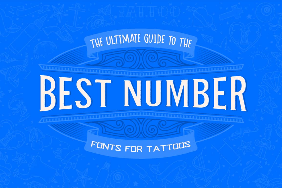
Discover the Best Number Fonts Ultimate Guide for Designers
Explore our ultimate guide to the best number fonts for designers. Discover unique styles, tips, and creative ideas to elevate your design projects with the perfect numerical typography.
When it comes to designing compelling visual content, the choice of fonts can significantly impact the overall aesthetics and effectiveness of your work. Numbers, often overlooked in font selection, play a crucial role in various design contexts, from digital interfaces and infographics to branding and print media. This comprehensive guide explores the best number fonts available, providing insights into their features and ideal use cases, ensuring your design projects stand out with precision and style.
A Short History of Numeric Fonts
Number fonts are specialized typefaces designed to render numerical characters with clarity and style. Unlike traditional text fonts, which may emphasize letterforms and spacing, number fonts focus on numerical legibility and design consistency. The right number font can enhance readability, convey professionalism, and contribute to the overall visual appeal of your design.
Why Number Fonts Matter
Choosing the appropriate number font is vital for several reasons:
- Legibility: Clear and distinct number fonts improve readability, especially in data-heavy designs like charts, dashboards, and financial reports.
- Aesthetics: The style of number fonts can complement or contrast with the rest of the design, enhancing visual harmony or creating impactful contrasts.
- Branding: Consistent use of number fonts can reinforce brand identity, especially in logos, product packaging, and marketing materials.
Top Number Fonts for Modern Design
Here's a curated list of some of the best number fonts available, each offering unique characteristics and benefits:
Helvetica Neue
Helvetica Neue is a modern classic, renowned for its clean and versatile design. It includes a range of numeral styles, including regular, bold, and light weights. Its simplicity and neutrality make it an excellent choice for various applications, from business documents to website design.
- Features: Clean lines, wide character spacing, and excellent readability.
- Ideal Use: Corporate branding, user interfaces, and editorial design.
Futura
Futura is a geometric sans-serif typeface that stands out for its precise and modern look. Its numerals are designed with uniformity and clarity, making it suitable for both digital and print design.
- Features: Geometric shapes, sharp angles, and consistent proportions.
- Ideal Use: Modern branding, digital displays, and graphic design.
Times New Roman
A staple in typography, Times New Roman offers a traditional serif style with well-defined numerals. Its timeless appearance makes it a reliable choice for formal documents and classic design projects.
- Features: Serif accents, traditional style, and high readability.
- Ideal Use: Academic papers, formal documents, and print publications.
Roboto
Roboto is a contemporary sans-serif typeface known for its versatility and readability. Its numerals are designed to be both functional and aesthetically pleasing, making it ideal for web and mobile interfaces.
- Features: Modern design, excellent legibility, and multiple weights.
- Ideal Use: Mobile apps, websites, and user interfaces.
Bebas Neue
Bebas Neue is a popular sans-serif typeface with bold and impactful numerals. Its design is perfect for headlines, posters, and any application where strong visual emphasis is required.
- Features: Bold strokes, clean lines, and high impact.
- Ideal Use: Headlines, posters, and advertising.
Montserrat
Montserrat is a modern sans-serif font inspired by urban typography. Its numerals are distinctive and stylish, making it a great choice for contemporary branding and design projects.
- Features: Modern and geometric design, versatile usage.
- Ideal Use: Branding, web design, and social media graphics.
Oswald
Oswald is a reworking of the classic Gothic style, adapted for digital use. Its numerals are narrow and well-suited for compact spaces, making it a good choice for headlines and captions.
- Features: Condensed form, strong presence, and readability.
- Ideal Use: Headlines, signage, and branding.
Lora
Lora is a serif typeface with a touch of elegance. Its numerals are well-balanced and legible, making it suitable for both print and digital projects that require a touch of sophistication.
- Features: Balanced design, elegant serifs, and high readability.
- Ideal Use: Print media, websites, and editorial design.
Raleway
Raleway is an elegant sans-serif typeface known for its clean lines and sophisticated numerals. It's ideal for high-end branding and design projects that demand a touch of class.
- Features: Elegant design, multiple weights, and modern appeal.
- Ideal Use: Branding, invitations, and high-end advertising.
Proxima Nova
Proxima Nova combines modern proportions with geometric shapes, making it a versatile choice for a wide range of design applications. Its numerals are designed to maintain legibility and style across different contexts.
- Features: Geometric design, clean lines, and multiple weights.
- Ideal Use: Web design, branding, and user interfaces.
Choosing the Right Number Font for Your Project
Selecting the appropriate number font involves considering several factors:
- Purpose: Determine the primary use of your design—whether it's for digital displays, print media, or branding.
- Style: Match the font style with the overall design aesthetic and tone of your project.
- Readability: Ensure that the numerals are clear and easy to read, especially if they will be used in data-heavy contexts.
- Compatibility: Choose a font that complements other typefaces used in your design, maintaining visual harmony.
Best Practices for Using Number Fonts
To maximize the impact of your number fonts, follow these best practices:
- Consistency: Use the same number font throughout your design to maintain a cohesive look.
- Hierarchy: Establish a clear typographic hierarchy by varying font weights and sizes to highlight important numerical information.
- Spacing: Pay attention to character spacing and alignment to ensure that numerals are legible and visually appealing.
- Testing: Test your number font in various contexts and sizes to ensure it performs well across different mediums and applications.
Choosing the right number font can elevate the quality of your design projects, enhancing both readability and visual appeal. By selecting from the best number fonts available and applying best practices in typography, you can create compelling and effective designs that resonate with your audience. Whether you're working on a corporate document, a modern website, or a creative branding campaign, the right number font will help you achieve clarity, style, and impact.
Explore the wide range of number fonts available, experiment with different styles, and find the perfect match for your design needs. Happy designing!
What's Your Reaction?