Scroll progress animations can enhance the visual appeal and interactivity of your web pages. By leveraging these animations, you can provide users with a more engaging and informative browsing experience. This guide delves into the technical aspects of implementing scroll progress animations using CSS, based on the insights from MDN Web Docs. We’ll explore the fundamental concepts, CSS techniques, and practical examples to help you master this powerful web design tool.
Understanding Scroll Progress Animations
What Are Scroll Progress Animations?
Scroll progress animations are visual effects that reflect the user’s scroll position on a webpage. As the user scrolls, these animations provide a dynamic representation of their progress through the content. This can be particularly useful for long-form content or applications where users need to understand how much content remains.
Why Use Scroll Progress Animations?
Scroll progress animations offer several benefits:
- Enhanced User Engagement: By visually indicating scroll progress, users can better gauge their reading or viewing progress.
- Improved Navigation: Users can easily navigate to different sections of the content, especially in lengthy articles or applications.
- Visual Appeal: Well-designed animations can add a polished, professional look to your website, making it stand out.
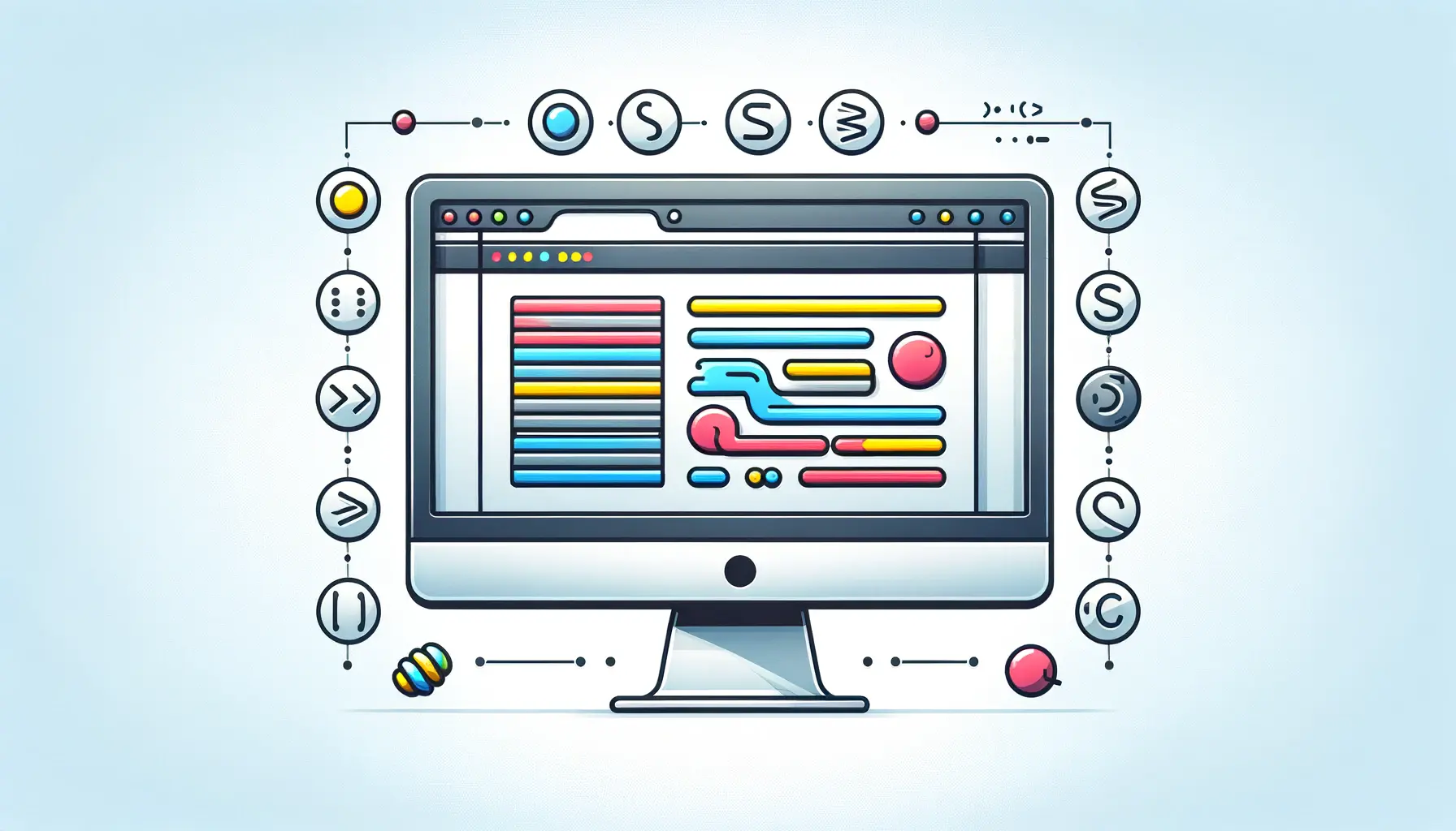
Implementing Scroll Progress Animations Using CSS
Basic Concepts and Terminology
Before diving into implementation, it's essential to understand some basic concepts:
- Viewport: The visible area of the web page in the browser window.
- Scroll Position: The current vertical position of the scroll bar relative to the top of the page.
- Scroll Progress: A percentage representing how far the user has scrolled relative to the total page height.
CSS Properties for Scroll Progress Animations
To create scroll progress animations, you’ll primarily use the following CSS properties:
1. position: fixed;
This property fixes an element’s position relative to the viewport. It’s crucial for placing scroll progress indicators in a consistent location on the screen.
2. width and height
Adjust the width and height properties to define the size of the scroll progress indicator.
3. background-color
Use this property to style the scroll progress indicator. Typically, a contrasting color is used to make the progress indicator stand out.
4. transition
This property allows for smooth transitions between different states of the scroll progress indicator. It’s essential for creating fluid animations.
Step-by-Step Implementation
Step 1: Setting Up the HTML Structure
Begin by creating a basic HTML structure for your scroll progress indicator. Here’s an example:
html> <html lang="en"> <head> <meta charset="UTF-8"> <meta name="viewport" content="width=device-width, initial-scale=1.0"> <title>Scroll Progress Animationtitle> <link rel="stylesheet" href="styles.css"> head> <body> <div class="progress-container"> <div class="progress-bar">div> div> <main> main> <script src="script.js">script> body> html>
Step 2: Styling with CSS
Add styles for the scroll progress indicator in your styles.css file:
body { margin: 0; font-family: Arial, sans-serif; } .progress-container { position: fixed; top: 0; left: 0; width: 100%; height: 5px; background-color: #e0e0e0; } .progress-bar { width: 0; height: 100%; background-color: #007bff; transition: width 0.25s; }
Step 3: Adding Scroll Progress with JavaScript
To dynamically update the scroll progress, use JavaScript. Create a script.js file with the following code:
document.addEventListener('scroll', function() { const scrollTop = document.documentElement.scrollTop; const scrollHeight = document.documentElement.scrollHeight; const clientHeight = document.documentElement.clientHeight; const scrollProgress = (scrollTop / (scrollHeight - clientHeight)) * 100; document.querySelector('.progress-bar').style.width = scrollProgress + '%'; });
Advanced Techniques and Customizations
Customizing the Progress Bar
You can further customize the progress bar to fit your design needs:
- Change Colors: Adjust the
background-color property in .progress-bar to match your website’s theme.
- Adjust Height: Modify the
height property in .progress-container to make the progress bar thicker or thinner.
Adding Animations
In addition to the basic transition, you can incorporate more advanced animations:
.progress-bar { width: 0; height: 100%; background-color: #007bff; transition: width 0.25s ease-in-out; }
Responsive Design Considerations
Ensure your scroll progress indicator is responsive and looks good on all devices:
- Viewport Units: Use viewport units (e.g.,
vw for width) to make the progress bar adjust dynamically to screen size.
- Media Queries: Implement media queries to adjust styles for different screen sizes.
Testing and Debugging
Cross-Browser Compatibility
Test your scroll progress animations across various browsers to ensure consistent behavior. Different browsers may render animations differently, so adjustments may be necessary.
Performance Optimization
For optimal performance:
- Minimize JavaScript Operations: Reduce the frequency of scroll events if performance issues arise.
- Optimize CSS: Keep CSS simple and avoid complex styles that could impact rendering performance.
Accessibility Considerations
Ensure that your scroll progress indicator is accessible to all users:
- Contrast: Use high-contrast colors for the progress bar to enhance visibility.
- Screen Readers: Add appropriate ARIA roles and labels if needed.
Conclusion
Scroll progress animations are a valuable tool for enhancing user experience on your website. By following the steps outlined in this guide and exploring advanced customization options, you can create visually appealing and functional scroll progress indicators. Utilize the insights from MDN Web Docs to refine your implementation and ensure that your scroll progress animations contribute positively to the overall user experience.


